This is probably the most well-known one, but not my favorite because it's so popular. You can see how how he contrasts the lighting to make it look as if the girl is the only thing in the frame. He wants to make it feel as if this girl is the only thing in the world you should care about. She's also looking at you, longingly, making it seem as if you and she are the only things in the world at this point in time.

Here's one of my favorites. It's a scenery shot, which are my favorite things to do in paintings and in photos. It really captures the essence of the place. This is Delft, a city near the coast of Holland (between Rotterdam and The Hague). It's very close to where le 2015 Tour is starting. Anyways, you can see just the simple life of the townspeople, and how serene and tranquil everything is. Compare that to the stress of big city life, and now you see why they're happier than us.

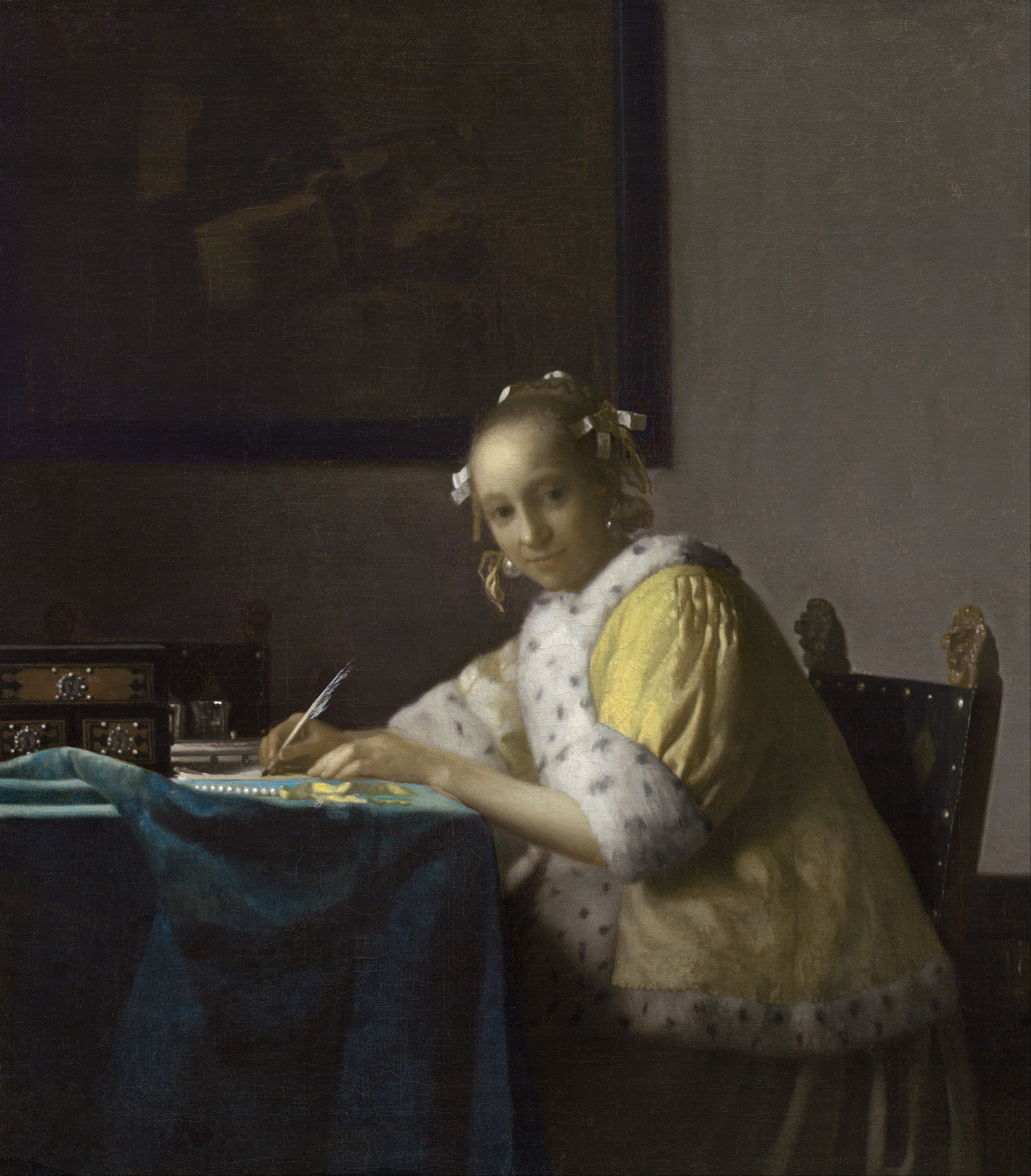
Here's another one of my favorites. Again, it follows Vermeer's standard style: interior with one or two figures, and they're doing a mundane day-to-day task. In this case, the woman is writing a letter, and you've just so happened to stop her mid-sentence. Instead of being angry, she doesn't really care, because she's not so stressed about writing letters that she would fret over every word. Also, note the contrasting colors and lighting between the woman's clothes, and the tablecloth. You can see all of the shiny things that have been highlighted by the lighting style. Incidentally, this painting is in Washington DC now, so you can go see it any time, but I was also able to see it when it went on loan (not unlike David House) to the Norton Simon museum in Pasadena in 2008-2009.
And this is the one that I've studied the most. It's a meta painting, as in the guy is painting in this painting. It's actually a painting of himself, painting a woman. Just look at that lighting man, and the correct reflection of light off of everything. The lighting highlights the woman being painted, but you also have to notice all the small details on the outsides of the painting. Everything in here has meaning. All of the small objects. The double eagle at the top of the chandelier. The map of the Netherlands, the chair and drape in the foreground. The items on the table, including a plaster mask (???). Everything has meaning, but we have no idea exactly what everything means. If you're interested, I highly suggest you read about this great piece of art, but not from me, of course, because I have no idea what I'm talking about.

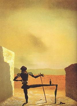
Incidentally, Dali referred to this specific painting many times in his own paintings in the 20th century, here's just one of them (THIS IS NOT A VERMEER!!):
Anyways, I hope that you enjoyed this small window into the world of Dutch art. If you're more interested than before, please go visit your local museum and go check some of these out. Or you should ask people from the Art History Deparment at McGill University; one of my course instructors is now here and knows everything about this stuff.
I may do a post about contemporaneous Flemish art as well.
I find the lighting interesting, it has a really modern type look to it, although maybe Vermeer intended to use it to contrast the content's mundane with the lighting, but the lighting feels really modern to me like you might see in cinematography these days except with the content also crisp. Like it's definitely more "art" than I care about in the sense of the "message", but it's seems to be a powerful mechanic for entertainment that maybe is underutilized.
ReplyDeleteMight be biased though because I tend to think high contrast is just better looking or something.
I also like contrast. These realist paintings are much better than that Impressionist French stuff that people call "Art"
DeleteThere's also a ton of virtuosic embellishment in most of his works. Like he's showing off the things that he can do.
Delete